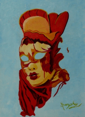
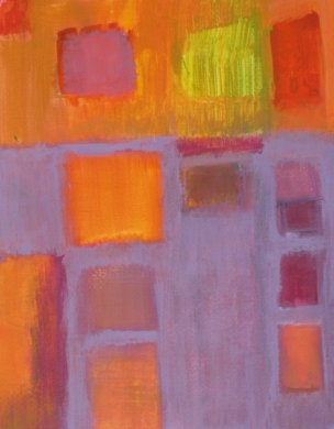
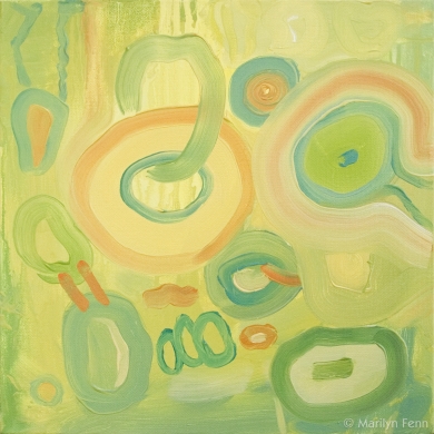
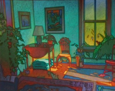
There seem to be all sorts of rules about color choices, from the by now fully disproven edict that redheads should never wear red, to the suggestions to visual artists that there are just some colors you should never put together, to the dos and don’ts of how to decorate your home or office to achieve a look that not only looks good but also promotes well being.
But rules are meant to be broken. Artists have long played with unusual contrasts and seemingly wrong combinations to stunning affect. Designers have made bold decisions creating a unique décor from ideas and items you would never have believed could work in practice.
So what is it that makes art that breaks the rules succeed so surprisingly well? Is it just that we expect not to like it and then when we do we are charmed all the more by the fact that whoever had the courage to create it actually pulled it off?
Are we naturally more pleased by something confident in its strangeness, that draws us in and changes our minds in spite of ourselves, than something that just does what it’s supposed to do and no more?
Whatever the reason, the next time you are looking for some original art for your working or living space, instead of following the conventional wisdom or making safe choices, why not try something different that doesn’t seem as if it should work at all? You might just end up with art so wrong it’s right.
Brian Sylvester is a guest blogger on WallSpin, and an artist on Zatista.
Related articles


Comments (0)