For a long time the word has been out that modern life is growing increasingly busy and complicated. Now more than ever it seems we are assailed daily by countless images and words online and off. In such times, it might not be your first choice to overstimulate yourself further by adding to the walls of your living or working space even more to look at and consider.
That’s where the art of simplicity comes in. Many artworks found in galleries both public and private were chosen to make a big impression, to provoke, to engage, to dominate and define the space they occupy. But sometimes art can be a less imposing presence.
Simple compositions, while they can be as impressive and engaging as more complicated pieces, have the effect of adding something to a room without overtaking it. You know it’s there, and you need it to be there, but it doesn’t quite demand your full attention all the time, every time.
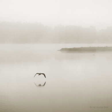
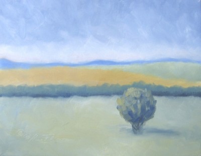
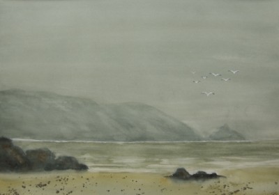
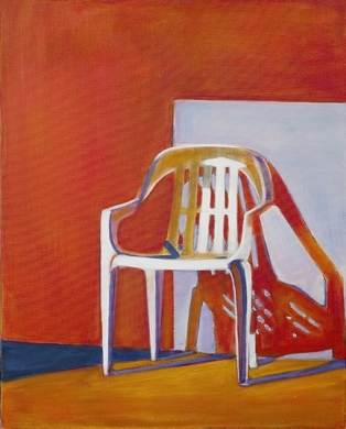
Artists make use of simplicity in many ways, whether through a landscape uncluttered with all but one point of interest, a muted or limited color palette, or just a realistic closeup of one subject without the distractions of other elements in the frame or any special stylistic effects.
Fortunately at Zatista there are artworks available that make every kind of style and theme statement, from the bold to the subtle. The bolder pieces may be the first to catch your eye, but the subtler ones can draw you in with an equally compelling albeit quieter voice. And sometimes quiet is the perfect company.
Brian Sylvester is a guest blogger on WallSpin, and an artist on Zatista.
Related articles
- Art Titles (zatista.com)
- Featured Artist Interivew: Deanna Fainelli (zatista.com)
- Start with Art (zatista.com)
- Shades of Gray (zatista.com)


Beautifully said and illustrated. How inspiring!