
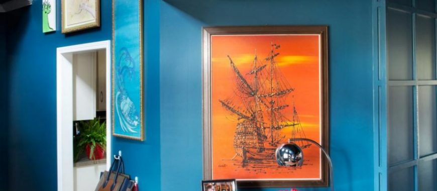
 When shopping for a piece of statement artwork for a focal wall in your home, think opposite. What does that mean, you ask? If your living room has a predominantly blue color theme, then orange or yellow in art will pack a powerful punch. If your bedroom features soft pinks, think green for the artwork. Or, if your home includes a palette of grays, then you’re in luck and your favorite pop of color will do quite nicely. Opposite, or complimentary colors work well together because they create a vibrant look and please the eye. Give it a try, you might just love it!
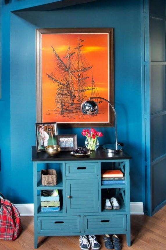
Comments (0)